 4
4 4
Irina Zhodani
|
Irina Zhodani, PhD Università nazionale “Kievo-Moghilianska Accademia” (Ucraina) La mostra di “pittura fonetica” di Alberto Sighele “Corniceria” (analisi intersemiotica) |
Ірина Жодані, PhD Національний університет «Києво-Могилянська академія» (Україна) Виставка «фонетичних картин» Альберто Зіґеле «Corniceria» (інтерсеміотичний аналіз) |
Irina Zhodani, PhD National University "Kievo-Moghilianska Accademy" (Ukraine) The exibition of "phonetic painting" by Alberto Sighele "Corniceria" (intersemiotic analysis) |
|
Nell’articolo si tratta della funzione della poesia visiva, in quanto sintesi di sistemi creativi secondari quali la letteratura e la pittura, usando come esempio la “pittura fonetica” di Alberto Sighele, italiano, esposta in una mostra personale nel maggio del 2011 in “Corniceria S. Maria”. |
У статті розглянуто функціонування візуальної поезії як синтезу вторинних моделюючих систем літератури та образотворчого мистецтва на |
The report deals with the function of visual poetry,
as synthesis of secondary creative systems such as literature and painting,
while using as an example the "phonetical painting" of the
Italian Alberto Sighele on show in the personal exibition of May 2011 at
"Corniceria S. Maria". |
|
Tra le opere presentate nella mostra alla “corniceria” si possono individuare tre principali gruppi tematici: 1) rapporti tra uomo e donna; 2) il Natale; 3) la famiglia |
У творах, представлених на виставці «Corniceria», можна виділити три основні тематичні групи: 1) взаємини між чоловіком та жінкою; 2) Різдво; 3) сім’я. |
Among works shown in the exhibition "Corniceria"
one may identify three main groups by theme: 1) Man-woman relationship; 2) Christmas; 3) Family. |
| Il primo quadro in questa divisione tematica dei rapporti tra uomo e donna è “Io sono la porta”(vedi quadro 1 alla fine dell’articolo). Su un pezzo di carta con manico, che visivamente richiama la borsa, è inserita la scritta in nero (qui si parla della porta e delle stanze) e in rosso (dove si parla della borsa e di cosa la borsa contiene): io sono la porta la sporta tu questa e l’altra stanza e quel che la seconda porta In questa opera noi leggiamo una allusione erotica: la porta (l’uomo) si trova tra due stanze (la donna), e al contrario la borsa (uomo) contiene in sé tutto “quel che la seconda porta” (la donna), due metafore che indicano un legame inseparabile e contemporaneamente la diversità tra i due sessi (contrasto tra il colore rosso e nero del testo). |
Першою в тематичному розділі взаємовідносин між чоловіком та жінкою є картина «Io sono la porta» (див. рис. 1 у кінці статті). На шматку паперу із ручкою, що візуально нагадує сумку, нанесений напис чорним (де мова йде про двері та кімнати) і червоним (де мовиться про сумку і про те, що сумка містить) кольорами: io sono la porta la sporta tu questa e l’altra stanza e quel che la seconda porta У цьому творі ми прочитуємо еротичний підтекст: двері (чоловік) знаходяться між двома кімнатами (жінкою) і навпаки сумка (чоловік) містить у собі все «те, що сумка містить» (жінку), що вказує на нерозривний зв’язок між чоловіком і жінкою і водночас на відмінності між двома статями (контрастні червоний та чорний кольори тексту). |
The first picture in this thematic group of man-woman
relationship is "Io sono la porta" (see picture 1 at the end of
the report). On one side of a paper bag, with a hand-band, clearly a bag,
a black text is inserted (here a door and rooms are mentioned) and in red
(a bag is mentioned and what the bag holds):
|
| L’opera “Essere felici”(vedi quadro 2) ci riporta di nuovo alla borsa femminile, ma questa volta il protagonista vuole aiutare a portarla, perché “essere felice è forse più facile sentendosi utile”. Non vuole niente in cambio dell’aiuto, solo toccarle la mano, vederne il sorriso e sentire il solito “grazie”: essere felice è forse più facile sentendosi utile e allora faccio una corsa per portarti la borsa e poco mi importa se la spesa pesa il mio guadagno è sfiorarti la mano il tuo sorriso e un grazie. Come vediamo, il testo stesso è di nuovo scritto sulla borsa improvvisata. Lo sfondo su cui si trova la borsa è tutto disseminato di fiori multicolori, ai quali può corrispondere la definizione di felicità. La borsa stessa è di color giallo, il colore del sole e dell’estate, e anche loro sono sempre associati alla felicità. [3, p. 363]. |
Твір «Essere felice» (див. рис. 2) знову повертає нас до жіночої сумки, але цього разу ліричний герой хоче допомогти піднести її, бо «бути щасливим значно легше, відчуваючи, що ти потрібен». І за цю допомогу він не хоче нічого, окрім як доторкнутись до її руки, побачити її посмішку на обличчі й почути звичайне «дякую»: essere felice è forse più facile sentendosi utile e allora faccio una corsa per portarti la borsa e poco mi importa se la spesa pesa il mio guadagno è sfiorarti la mano il tuo sorriso e un grazie Як бачимо, сам текст знову написаний на імпровізованій сумці. Тло, на якому знаходиться сумка, усіяне різнокольоровими квітами, які цілком можна співвіднести з поняттям щастя. Сама сумка також не випадково жовтого кольору – кольору сонця і літа, що у нас завжди асоціюється зі щасливими моментами в житті… [3, с. 363]. |
The work "Essere felici" (see
picture 2) takes us again back to the female bag, but this time the
protagonist wants to help carry it, because" you are more easily
happy while being handy". He doesn't want anything in return for his
help, just touching her hand, seeing her smile, having her usual "thank
you": essere felice è forse più facile sentendosi utile e allora faccio una corsa per portarti la borsa e poco mi importa se la spesa pesa il mio guadagno è sfiorarti la mano il tuo sorriso e un grazie. As we see, again the text is written on an improvised bag. The background for the bag is all strewn with many-coloured flowers, to which the definition of happiness corresponds. The bag itself is yellow, the colour of the sun and summer, and they are also associated with happiness. [3, p. 363]. |
| Un altro quadro fonetico di Alberto Sighele sul tema dei rapporti tra uomo e donna è “Ieri” (vedi quadro 3): ieri eravamo due gatti neri e la tua coda era il mio baffo Anche quest’opera contiene un contesto erotico: “e la tua coda era il mio baffo”. Ma l’autore, per se stesso e per chi l’accompagna, non a caso, sceglie l’immagine della gatta, perché i gatti erano per tanti popoli animali sacri. Nell’antico Egitto, in particolare, esisteva il culto della Dea Bastet (o Bast), che aveva l’immagine di una donna con la testa di gatta, e simboleggiava la notte, il piacere, la fertilità, le forze difensive (era custode del matrimonio). Il gatto nero in qualche paese è simbolo della fortuna (l’Inghilterra), in altri invece è l’opposto, profeta di malocchio (Ucraina, gli Stati Uniti) [4, pag.867-869; 1, pag.89]. Si può inoltre trovare un riferimento ai gatti in amore di marzo in cerca di piacere. Adesso ci rivolgiamo al disegno del quadro. Il foglio di carta con il testo dell’opera è posato su una improvvisata morbida poltrona, dove ai gatti infatti piace molto stirarsi…In questa maniera lo spettatore immagina al posto del foglio di carta i due gatti neri, e questo rafforza l’associazione di idee nell’opera. |
Ще одна «фонетична картина» Альберто Зіґеле на тему взаємовідносин чоловіка та жінки «Іeri» (див. рис. 3): ieri eravamo due gatti neri e la tua coda era il mio baffo Цьому твору також притаманний еротичний контекст: «і твій хвіст був моїм вусом». Але автор не випадково для себе та своєї супутниці обирає образ кішки, адже кішки були священними тваринами у багатьох народів. У Давньому Єгипті, зокрема, існував культ богині Бастет (або Баст), що зображувалась переважно у вигляді жінки з головою кішки і пов’язувалась із ніччю, задоволеннями, родючістю та захисними силами (була хранителькою шлюбу). Чорна кішка в деяких країнах символізує удачу (Англія), в інших же, навпаки, є провісником неприємностей (Україна, США) [4, с. 867–869; 1, с. 89]. Крім того, можна провести паралелі із «березневими котами», які шукають задоволення. Тепер звернемось до зображення на картині. Аркуш паперу із текстом твору розташований на імпровізованому м’якому кріслі, на якому так полюбляють вилежуватись коти… Таким чином реципієнт уявляє на місці аркуша паперу двох чорних котів, що підсилює асоціативний ланцюг твору. |
An other phonetical picture by Alberto
Sighele on the theme of man-woman relationship is "ieri" (see
picture 3): ieri eravamo due gatti neri e la tua coda era il mio baffo Also this picture holds an erotic context: "and your tail was my moustache". But the author, for himself and his female company, not meaninglessly, choses the image of the female cat, for cats were sacred for many peoples. In ancient Egypt in particular there existed the cyult of Bastet (or Bast) Goddess, who had the image of a woman with a cat head, and symbolized night, pleasure, fertility, defensive forces (she was the custodian of marriage). The black cat is a symbol of fortune in some countries (England), in others of the opposite, prophet of evil spell (Ukraine, and the United States) [4, page 867-869; 1, page 89].One may also recall cats in love in March seeking pleasure. Now we turn to the drawing in the picture. The paper sheet with the text of the work is laid on an improvised soft sofa, where cats like stretching...This way the spectator imagines the two black cats in the place of the paper sheet, and this reinforces the association of ideas in the work. |
|
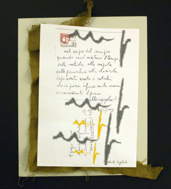
L’opera «Sul corpo del campo» (vedi quadro 4) ha due piani. Da una parte, si parla della terra arata, chе si rafforza con metodi visivi: le lettere “m” scritte a mano e “p” nella parole «campo» e «tempo» alludano ai solchi («m») e all’aratro («p»). Gli elementi di queste immagini e delle lettere non si ripetono una sola volta e lo stesso foglio di carta con il testo si trova sulla juta, il cui colore marrone è associato alla terra. Dall’altra l’autore vede la terra come donna, il che è confermato dall’elenco di parti del corpo umano: «dalle natiche alle scapole / dalle ginocchia alla clavicola». In questo contesto la lettera «m» già si associa non solo ai solchi ma anche alle natiche, e «p» – con l’organo sessuale maschile – «simbolo del principio fecondativo». «Se la terra è il principio “femminile”, allora l’aratura può essere simbolo dell’atto sessuale» [1, p. 152]. A parte questo, il color marrone richiama l’associazione con la pelle femminile abbronzata.
sul corpo del campo |
Твір «Sul corpo del campo» (див. рис. 4) має два плани. З одного боку, тут мова йде про виорану землю, що підсилюється візуальними засобами: написані вручну літери «m» і «p» у словах «campo» і «tempo» нагадують ріллю («m») та плуг («p»). Елементи цих образів та літер кілька разів повторюються, а сам аркуш паперу з текстом розміщений на мішковині, коричневий колір якої асоціюється із землею. З другого боку, автор бачить землю як жінку, що підтверджує перелік частин тіла людини: «dalle natiche alle scapole / dalle ginocchia alla clavicola». У цьому контексті буква «m» уже асоціюватиметься не з ріллею, а із сідницями, а «p» – із чоловічим статевим органом – «символом запліднюючого начала». «Оскільки земля є «жіночим» началом, то оранка може виступати символом статевого акту» [1, с. 152]. Крім того, коричневий колір викликає асоціації з жіночою засмаглою шкірою.sul corpo del campo |
The work "sul corpo del campo" (see
picture 4) has two levels.On the first one, the subject is the ploughed
field, reinforced by visual means: the letters "m" and "
p" hand-written in the words "campo" and "tempo"
allude to the furrows ("m") and to the plough ("p").
The elements of these images and of letters are not repeated only once and
the very sheet of paper with the text is laid on jute, whose brown colour
is associated with the earth. On the other level the author sees the earth
as woman, which is confirmed by the list of human body words: "from
buttocks to shoulderblades/ from knees to collarbone". In this
context the letter "m" is associated not only to furrows but
also to buttocks, and "p" - with the male sex organ -
"symbol for the fecundating principle". "If the earth is
the "female" principle, then ploughing may be the symbol of the
sexual act" [1, p. 152]. Besides, the brown
colour recalls the association with the sun-bathed female skin. sul corpo del campo quando sarà maturo il tempo dalle natiche alle scapole dalle ginocchia alla clavicola dopo averti arato i solchi che io possa infine con la mano accarezzarti il grano nelle spighe? |
|
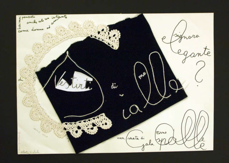
L’opera “Hai mai pensato…”(vedi quadro 5) è molto interessante nei metodi espressivi, poiché le lettere qui sono “disegnate” da un colletto di pizzo (lettera “c”), da filo (“scialle”) e da carta (“vestirti”). hai mai pensato anche solo un istante
|
Твір «Hai mai pensato…» (див. рис. 5) надзвичайно цікавий своїми виражальними засобами, оскільки букви тут зображено за допомогою мережаного комірця (літера «с»), ниток («scialle») та паперу («vestirti»). hai mai pensato anche solo un istante come donna ed amante di vestirti di me come uno scialle una serata di gala attorno alle spalle signora elegante? Значущим є також використання у творі літер із заокругленими обрисами (l, a, e, s), що візуально нагадує обвиття шалі навколо шиї. |
The work “Hai mai pensato…”
(see picture 5) is very interesting in its communicative means, as letters
are here "drawn" by a collar lace (letter “c”), by a
thread (“scialle”) and by paper (“vestirti”). hai mai pensato anche solo un istante come donna ed amante di vestirti di me come uno scialle una serata di gala attorno alle spalle signora elegante? Relevant in this work is also the use of letters with rounded outline (l,a,e,s) that visually recall the wrapping of the shawl around the neck. |

|
E’ ricco di valenze espressive il quadro “Punteggi la mia giornata con tazzine di caffè” (vedi quadro 6): sul vassoio improvvisato di un sacchetto di carta per commestibili vediamo un centrino di pizzo bianco, un biscotto rotondo, qualche lettera “e”, che visualmente ti ricordano le tazzine di caffè (una di loro sul centrino di pizzo) e di fatto il testo della poesia:
|
Багата
на
виражальні
засоби і
картина «Punteggi la mia
giornata con tazzine di caffè» (див.
рис. 6): на
імпровізованому
підносі із
паперового
пакету для
їжі бачимо
білу
мережану
серветку,
кругле
печиво,
кілька
літер «e»,
що
візуально
нагадують
чашки з
кавою (одна з
них на
мережаній
серветці) та
власне
текст твору: Причому
літери «e» є не
просто
візуальними
елементами,
а частинами
тексту,
зокрема у
першій
літері
зашифровано
слово «caffè»,
у другій – «è», у третій – «tre»
і у
четвертій – «te».
Загалом
такий
спосіб
подачі слів
нагадує
ребуси,
оскільки
реципієнтові
потрібно
докласти
певних
зусиль, щоб
дешифрувати
повідомлення
адресанта.
Незвичним є
і те, що «1» та «2»
зазначені у
вигляді
цифр, а «3» –
закодованим
словом.
|
The picture “Punteggi la mia giornata con tazzine di caffè”
(see picture 6) is rich in communicative qualities: on the improvised tray
made by food paper bag we see a little white lace doily, a round biscuit,
some "e" letters, that visually recall coffee cups (one of them
on the lace doily), and indeed the text of the poem: punteggi la mia giornata con tazzine di caffè è il tuo modo di voltare pagina uno due tre un pretesto per sedermi vicino per dirmi punto e a capo ricomincio da te Beside this these "e" are not simply visual elements, but part of the text, in particular, in the first letter is codified the word "caffè", in the second "è", in the third "tre", and in the fourth "te". As a whole this way of introducing words reminds us of a rebus puzzle, because the spectator needs an effort to decodify the message conveyed. Unusual also the fact that "1" and "2" are given as numbers while "3" is given by the word in code. Anyway, the text given is very close to the semiotic vision of the world, as an open book and an unexhaustible thesaurus of symbols (compare the outlook on the world by Guglielmo of Baskerville in the novel by Umberto Eco "the Name of the Rose":"...I teach you to recognize the signs through which the world talks to us as a great book"). The concept of life as a book is expressed by Alberto Sighele also by visual means, in particular in the bottom left corner we actually see three pages half open, which corresponds to the text " punteggi la mia giornata con tazzine di caffè/è il tuo modo di voltare pagina
|
|
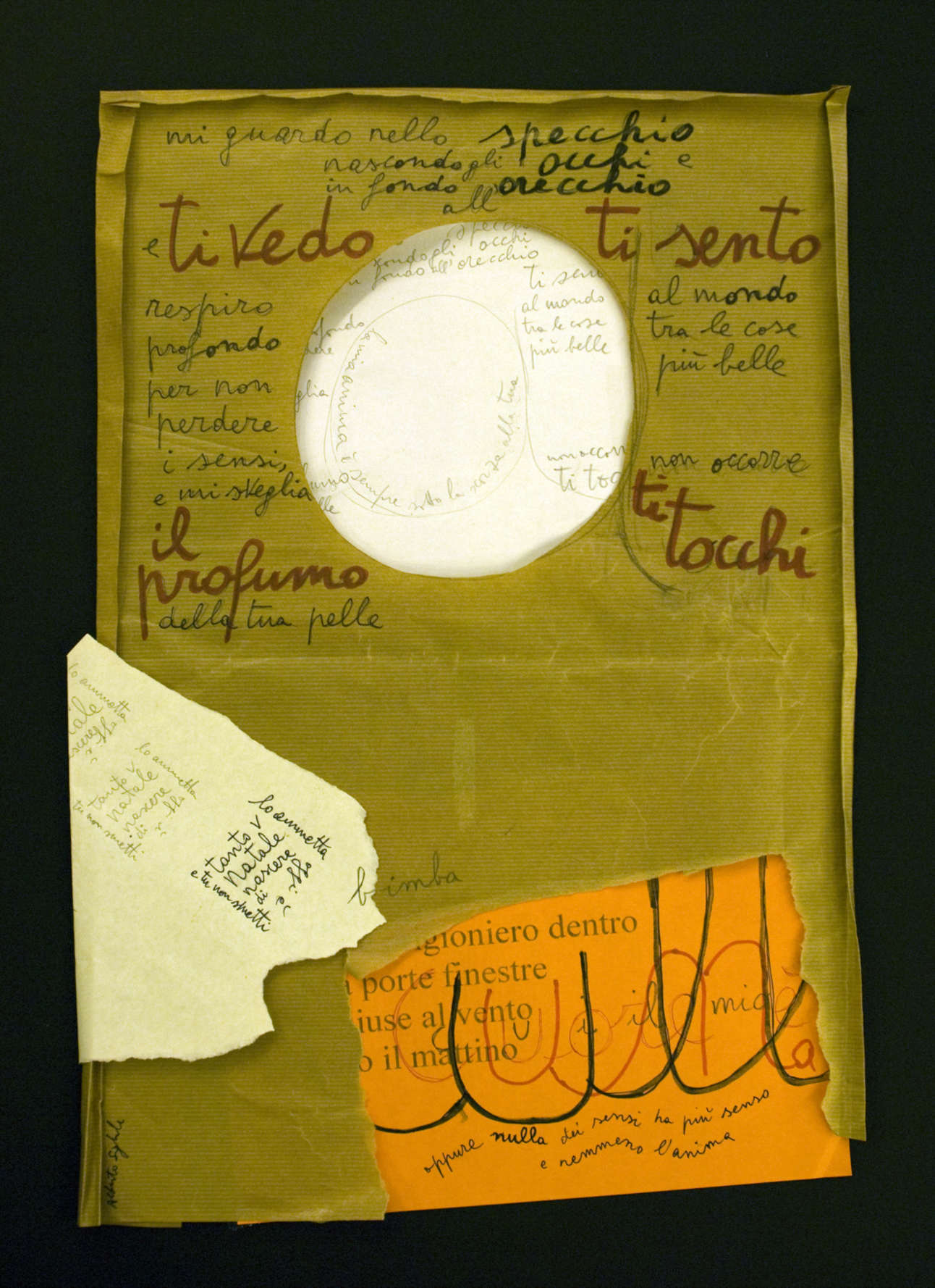
“Il quadro fonetico” “Mi guardo allo specchio e ti vedo” (vedi quadro 7) visivamente ricorda
lo specchio nel quale il protagonista si guarda. |
«Фонетична картина» «Mi guardo allo specchio e ti vedo» (див. рис. 7) візуально нагадує дзеркало, у яке дивиться ліричний герой: mi guardo allo specchio e ti vedo nascondo gli occhi e in fondo all’orecchio ti sento respiro profondo per non perdere i sensi e mi sveglia il profumo della tua pelle al mondo tra le cose più belle non occorre ti tocchi la mia anima è sempre sotto la scorza alla tua oggi è Natale tanto vale lo ammetta che tu non smetti di nascere bimba cui il mio cuore è una culla oppure nulla dei sensi ha più senso e nemmeno l’anima В імпровізованому дзеркалі ми бачимо написане простим олівцем відображення всього тексту твору, а по центру – літеру «a» (початкову від слова «anima»). До речі, самé дзеркало також зображене у вигляді літери «a». Із цього можемо зробити висновок, що автор сприймає відображення людини в дзеркалі як вмістилище душі (див. символіку дзеркала [1, с. 64]). Проте ліричний герой бачить у ньому відображення не себе, а коханої. Підтвердженням цьому слугують слова, написані всередині літери «a»: «la mia anima è sempre sotto la scorza alla tua». Це свідчить про такий рівень у стосунках між близькими людьми, коли душі зливаються, вони невіддільні. Варто також звернути увагу на те, що з чотирьох сторін від дзеркала виділено червоним кольором слова «ti vedo», «ti sento», «il profumo» та «ti tocchi» , що відсилає нас до чотирьох органів чуття: зору, слуху, запаху та дотику. Текст, який стосується Різдва, записаний у вигляді головоломки, що нагадує нам кубик Рубіка, бо слова тут хаотично перемішані і реципієнтові, щоб прочитати текст, доводиться спочатку розв’язати лінгвістичну загадку. Цікаво те, що текст у «кубику Рубіка» двічі віддзеркалюється, оскільки написаний він простим олівцем, як і в імпровізованому дзеркалі. Третя просторово відмежована частина тексту імітує прямокутну кімнату, в якій за допомогою друкованого тексту-тла вимальовуються окремі предмети (двері, вікно) та створюється справжня ідилія людських стосунків, коли за вікном ранок та легкий вітерець, а всередині – колиска-серце ліричного героя, що стало для коханої безпечним, спокійним, захищеним місцем (слово «cuore», написане червоним кольором, знаходиться всередині слова «culla»). У цьому й полягає духовна єдність між чоловіком і жінкою, бо «oppure nulla dei sensi ha più senso / e nemmeno l’anima». |
"The phonetic picture" "Mi
guardo allo specchio e ti vedo" (see picture 7) visually reminds us
of the mirror into which the protagonist is looking at himself. mi guardo allo specchio e ti vedo nascondo gli occhi e in fondo all’orecchio ti sento respiro profondo per non perdere i sensi e mi sveglia il profumo della tua pelle al mondo tra le cose più belle non occorre ti tocchi la mia anima è sempre sotto la scorza alla tua oggi è Natale tanto vale lo ammetta che tu non smetti di nascere bimba cui il mio cuore è una culla oppure nulla dei sensi ha più senso e nemmeno l’anima In the improvised mirror we see the whole text of the poem reflected written in pencil, and there is a letter "a" in the center (initial letter of "anima"). By the way, also the mirror is drawn like a letter "a". From this we can deduce that the author perceives the reflection of the person in the mirror as a vessel for the soul (see symbolism of the mirror [1, p.64]). The protagonist, though, sees in the mirror the reflection, not of oneself, but of his beloved one. To confirm this the words written within the letter "a":" my soul is always under the skin of yours". And this is evidence of the level of intimacy reached in the relationship between people when their souls melt into each other and are inseparable. It's worthwhile noticing as well on the four external sides of the mirror the marking in red of the words "ti vedo","ti sento","il profumo" e "ti tocchi", that refer to the four organs of sense: sight, hearing, smell, touch. The text, which mentions Christmas, is written like a riddle, which reminds us of the coloured "Rubik cube" with which we all played 20 years ago, because words are here chaotically mixed and the spectator, to read the text, is compelled, first of all, to solve the linguistic riddle. Interesting the fact that the text in the "Rubik cube" is reflected twice, it is in fact written in pencil as in the improvised mirror. The third part, separated from the rest in the frame of the picture, imitates a rectangular room, in which, helped by the printed text on the background, some spaces are cut (door, window) and a real idyll of human relationship is created, when behind the window there's morning and a light wind, but on the inside there's the craddle-heart of the protagonist, that has become for the loved one a safe place, protected and quiet. (The word "cuore" is written in red, and is placed in the centre of the word "craddle"). This is indeed the basis of the spiritual unity between man and woman, "if not, nothing of the senses makes sense/ not even the soul".
|

|
Il prossimo lavoro, che continua questo tema, è “Ti tengo davanti agli occhi” (vedi quadro 8). La sua particolarità è che il testo è tagliato a pezzi, sparpagliato in diverse parti del quadro, e il lettore deve, prima di tutto, comporlo come un puzzle. Forse come la donna cerca la risposta alla domanda “perché?”, anche lo spettatore deve cercare le parti del testo diviso, ma le forme particolari delle parti ritagliate lo aiutano a decifrare il rebus. Nonostante ciò, dopo aver composto tutte le parti delle frasi in unità, lo spettatore si imbatte ancora in un scoglio, sotto la superficie: Il senso dell’opera. Di cosa sta chiedendo la protagonista al suo amato e perché il tentativo di darle una risposta deve essere così estremo...
|
Наступний твір, що продовжує тему, – «Ti tengo davanti agli occhi» (див. рис. 8). Особливість його полягає в тому, що текст тут розрізаний на частини і читач повинен насамперед скласти його як пазл, розкиданий по різних частинах картини. І, мабуть, як жінка шукає відповідь на запитання «чому?», так і реципієнт шукає частини розділеного тексту, а дивовижні форми вирізаних частин допомагають читачеві правильно розв’язати цю головоломку: ti tengo davanti agli occhi trafitto dai tuoi occhi tragitto che mi chiedano perché e che il resto del mio tempo sia un tentativo estremo di dar loro una risposta Проте, склавши всі частини речень в одне ціле, реципієнт натикається на ще один підводний камінь – зміст твору: про що саме запитує героїня свого обранця і чому спроба відповіді має бути екстремальною. |
The next work that continues this theme is "Ti
tengo davanti agli occhi" (see picture 8). Its pecularity is that the
text is cut into pieces, scattered in different parts of the picture, and
first of all the reader must compose it like a puzzle. Perhaps, the same
way the woman tries to get an answer to the question "perché?",
also the spectator has to sort out the fragmented parts of the text, but
the particular shapes of the cut pieces help him decode the rebus.
|
|
I protagonisti del “quadro fonetico” “Il fuoco d’artificio fa di tutto” (vedi quadro 9) sono l’uomo - il fuoco d’artificio e la donna – la luna. Nel suo impetuoso desiderio di piacere alla donna, il fuoco d’artificio-uomo fa tutto il possibile per attirare l’attenzione, “esercizi da ciuffo d’erba”, “si specializza nello stelo,” e in alto tra noi e il cielo (nel quadro dal filo d’erba si distende lo spago che è la “f” di “fuoco”). Davvero si concretizzano visivamente sulla carta i fuochi d’artificio, creati dai grumi di parole “fuoco d’artificio” e “attirare l’attenzione”. Il ritaglio di scintille è realizzato dalle lettere “ff” e “tt”. Ma la donna-luna non concede attenzione agli sforzi dell’uomo e rimane a lui indifferente, perché è lei la regina del cielo. il fuoco d’artificio fa di tutto per attirare l’attenzione ma la luna vi sembra indifferente fa esercizi da ciuffo d’erba si specializza nello stelo nella distanza tra noi e il cielo tra noi e lei invece di lei è slancio curva petalo in caduta la corolla e l’alone la regina del cielo è lei lui l’ultimo arrivato. Se vogliamo approfondire il simbolismo delle immagini allora il fuoco simboleggia il principio attivo maschile e “il fuoco della passione”, cioè la sessualità. [1, pag. 129-130], e la luna corrisponde alla definizione di donna, acqua, notte. La dea romana della luna, Diana, (presso i greci: Artemida) simboleggia seduzione, incostanza, instabilità, “gelida” indifferenza [4, pag.250-251], ciò che in effetti vediamo nell’opera. |
Героями «фонетичної картини» «Il fuoco d’artificio fa di tutto» (див. рис. 9) є феєрверк-чоловік та місяць-жінка («la luna»). У своєму прагненні сподобатися жінці феєрверк-чоловік робить усе можливе, щоб привернути її увагу: «виконує вправи пучка трави», «спеціалізується у стеблі» у вишині між нами і небом (на картині стебло та траву викладено
ниткою із літери «f» – «fuoco»). І справді на папері візуально вимальовуються вогні феєрверка, створені зі словосполучень «fuoco d’artificio» та «attirare l’attenzione». Основний візерунок вогників творять літери «ff» та «tt». Проте жінка-місяць не звертає уваги на старання чоловіка і залишається байдужою до нього, бо вона – «королева небес». il fuoco d’artificio fa di tutto per attirare l’attenzione ma la luna vi sembra indifferente fa esercizi da ciuffo d’erba si specializza nello stelo nella distanza tra noi e il cielo tra noi e lei invece di lei è slancio curva petalo in caduta la corolla e l’alone la regina del cielo è lei lui l’ultimo arrivato Якщо заглибитися у символіку образів, то вогонь символізує чоловічу активну стихію та «вогонь пристрасті», тобто сексуальність [1, с. 129–130], а місяць співвідноситься з такими поняттями, як жінка, вода, ніч. Римська богиня місяця Діана (у греків Артеміда) символізувала цноту, непостійність, мінливість, «льодяну» байдужість [4, с. 250–251], що ми і бачимо у творі. |
The protagonists of the "phonetic picture"
"Il fuoco d'artificio fa di tutto" (see picture 9) are the man -
the firework and the woman - the moon. In his impetuous desire to
please the woman, the firework-man does all he can to get her attention,
"grass tuft exercises", "gets unrivalled in the stalk,"
and up between us and the sky (in the picture from the grass blade rises a
thread that is the "f" of "fire") come indeed visually
into existence on paper the fireworks, created by clusters of words
"fuoco d'artificio" and "attirare l'attenzione". The
star of sparks is realized by the letters "ff" and "tt".
But the woman-moon does not concede her attention to the efforts of the
man and remains indifferent to him, because she alone is the queen of the
sky.
|
|
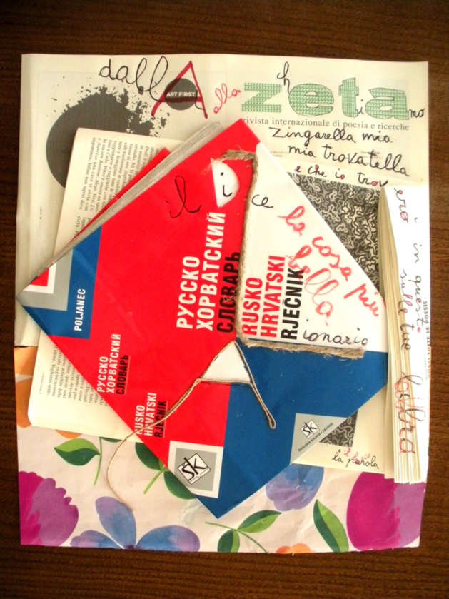
Il quadro “Il dizionario dice” (vedi quadro 10) continua il tema dei rapporti tra uomo e donna, ma aggiunge nuove allusioni: |
Твір «Il dizionario dice» (див. рис. 10) продовжує тему взаємин між чоловіком та жінкою, але доповнює її новими підтекстами: il dizionario dice dalla a alla zeta che ti amo zingarella mia mia trovatella e che io troverò in questo libro sulle tue labbra la cosa più bella: la parola e il bacio Ліричний герой зізнається в коханні своїй половинці за допомогою словника і міжнародного журналу поезії та досліджень «Zeta», причому саме з назви останнього утворено найважливіші слова («che ti amo»). Те, що за основу колажу взято журнал поезії, має досить символічне значення, оскільки жодний інший рід літератури не може так яскраво виражати почуття, як лірика. Наявність словника також не випадкова. Можна припустити, що кохана ліричного героя не італійка, тому для порозуміння з нею і потрібен словник, а вибір російсько-хорватського словника, найімовірніше, вказує на її слов’янське походження. Але далі ми читаємо: «zingarella mia / mia trovatella». Чи варто ці слова розуміти буквально? Мабуть, ні. Думаю, йдеться швидше про її вміння причаровувати чоловіків, яке притаманне молодим циганкам, а також про її немісцеве походження. Далі автор порівнює книгу з губами коханої, він навіть накладає ці два слова «libro» та «labbra» одне на одне, але для розрізнення перше пише чорним кольором (чорні букви у словнику), а друге, звісно ж, – червоним (червоні губи). Будучи справжнім поетом, він вважає найкрасивішими у світі дві речі: «la parola e il bacio», які він частково об’єднує літерою «а», оскільки губи коханої вимовляють найприємніші слова та породжують найсолодший поцілунок. Також варто відзначити подвійне обігравання літер А та Z, які починають і закінчують алфавіт. Відповідно вони символізують початок та кінець, але чого? Можливо, твору, книги, кохання, а може, й усього життя. Імовірно, автор хотів підкреслити, що він через усе життя проносить дві найважливіші речі: творчість та кохання, про які і йдеться у творі. Цікавим є і матеріальне втілення цієї ідеї, оскільки Альберто використовує художнє оформлення словника, зокрема поділ обкладинки на кольорові зони, для утворення за допомогою шнурка першої та останньої літер алфавіту А та Z. Ще одне, на що варто звернути увагу в цьому творі, – це символіка кольорів. Звісно, червоний колір, є кольором губ, кохання, пристрасті, краси [3, с. 365]. Білий виконує роль тла як у книзі чи словнику, так і безпосередньо на картині, а синій, можливо, поданий як контрастний до червоного і фактично прирівнюється до чорного (пор. чорно-червоне написання тексту твору). Крім того, у нижній частині картини тлом слугує подарунковий папір із різнокольоровими квітами, який на картині «Essere felice» ми співвідносили з поняттям щастя. У цьому випадку він виконує ту ж функцію: свідчить про щасливі, радісні хвилини, проведені з коханою людиною. |
The picture "Il dizionario dice" (see
picture 10) continues the theme of the man-woman relationship, but ads new
allusions: il dizionario dice dalla a alla zeta che ti amo zingarella mia mia trovatella e che io troverò in questo libro sulle tue labbra la cosa più bella: la parola e il bacio The protagonist reveals his love for his beloved one by means of a dictionary and of the international poetry and research magazine "Zeta", and this way, exactly this title creates the most important words ("that I love you"). This fact, that the basis for the collage be a poetry magazine, has a remarkable symbolic relevance, because no other literary genre may better convey feelings than poetry. The presence of a dictionary is also not casual. One may guess the person loved by the protagonist might not be Italian: to communicate with one another they need a dictionary, and the choice of a Russian-Croatian dictionary is likely to reveal her slav origin. Later we read "zingarella mia/ mia trovatella". Shall we take these words literally?Probably not. I assume, it might rather refer to her capacity to seduce men, typical of young gypsies, and once again this confirms the fact that she is not from the author's place. The author then compares the book to the lips of his beloved. He goes as far as to make these words "libro" and "labbra"overlap. But to distinguish the former, writes in black, (black letters in a dictionary), and the latter is of course in red (red lips). Being a true poet, he deems "la parola e il bacio" the two most beatiful things in the world, that he partially unites in the letter "a", as the lips of his beloved pronounce the most tender words and melt into the sweetest kiss. Also the play between A and Z is worth remarking; they begin and close the alphabet. Correspondingly they symbolize the beginning and the end, but of what? Of the work, of the book, of love, may be of the whole life. Apparently the author wanted to emphasize that through life the two most important things to tim are art and love, which is in fact what the picture is about. Interesting is the concrete realization of this idea, for the artistic use of the cover of the dictionary, in particular its division in coloured areas to create by means of a thread, the first and the last letter of the alphabet A and Z. One more thing yet on which to draw the attention in this picture is the symbolism of colours. It's well known that the colour red is the colour of lips, love, passion and beauty [3, page 365].White is the background as in a book or a dictionary, the same way it is also in the picture; blue is given as a contrast to red and as a matter of fact has the function of black (see the black-red writing of the text in the picture). Besides that, in the lower section of the picture the background is rendered with paper for presents in multicoloured flowers. The same paper to wrap presents in, we find also in the picture "Essere felici" that I have related to the definition of happiness. In this case this paper has the same function: it witnesses happy and joyful moments spent with the person you are in love with.
|

|
Spostiamoci adesso sull’altro tema della mostra alla “Corniceria S. Maria”: il tema del Natale. L’opera “Natale” (vedi quadro 11) composta dal padre per suo figlio Davide. Natale non è concetto rozzo è Dio che nasce in mezzo la stella (di Davide) su una stalla fiato animale non sono nel bastone di Giuseppe io sono per te nell’alito del bue e l’asinello papà Alberto Sulla pagina semistrappata di un calendario da parete con l’immagine dell’inverno e della neve (inseparabili attributi del Natale) ci sono fogli di carta di color arancione, verde vivo e bianco (i colori sgargianti come sempre sono associati alle festività) con la scritta della poesia. A proposito le parole “Natale è Dio” sono evidenziate con il colore rosso come anche la stella disegnata sulla parola “stalla”. Interessante è il fatto che la parola “Dio” è strappata in due parti: “D” e “io” (“io” si trova al centro della stella), che testimonia dell’enorme abisso, che si è creato tra Dio e la persona contemporanea. Oltre questo, vale la pena fare attenzione alla scrittura della lettera “D”, l’arco evidenziato dal rosso e l’asta è di colore grigio. La continuazione della parola “io” rimane scritta con la semplice matita. Poiché Natale è la festa della nascita di Gesù, allora la scrittura della parola “Dio” con l’utilizzazione del contrasto dei colori può testimoniare della natura divina e umana di Gesù. Occorre ora far attenzione alla simbolica di quest’opera. Gesù nel cristianesimo è caratterizzato come “la stella luminosa del mattino”, a parte questo, proprio la stella ha guidato i magi al posto della nascita di Gesù. Nel testo questa stella si chiama stella di Davide. Davide nella tradizione cristiana è immagine e diretto antenato di Cristo [2, pag 176]: “Io sono la radice e progenie di Davide, stella luminosa del mattino”(Apoc., 22:16). Ma la stella di Davide, o la stella di Betlemme (simbolo del Natale di Cristo), è di sei punte [1, pag.62], e tuttavia sul quadro di Alberto Sighele è un pentagramma. Ma la stella di Gesù è proprio di 5 punte, come il simbolo dell’essere umano ideale, sul piano sia fisico che spirituale, perché l’uomo è in possesso di 5 virtù: amore, sapienza, verità, giustizia e bontà. Si chiamano proprio virtù di Cristo e vengono simboleggiate dal pentagramma. A parte questo, nel cristianesimo la stella a cinque punte è legata con le cinque ferite di Gesù [4, pag 159 - 163]. Il testo finisce con i simboli dell’asino e del bue. L’asino nella tradizione cristiana rappresenta l’umiltà e la pazienza, proprio lui ha portato la vergine Maria a Betlemme. E nel momento della nascita di Gesù presso la mangiatoia c’erano il bue e l’asino |
Тепер перейдемо до другої тематичної частини виставки «Corniceria» – теми Різдва. Твір «Natale» (див. рис. 11) створений батьком для свого сина Давида. Natale non è concetto rozzo è Dio che nasce in mezzo la stella (di Davide) su una stalla fiato animale non sono nel bastone di Giuseppe io sono per te nell’alito del bue e l’asinello papà Alberto На надірваній сторінці із настінного календаря із зображенням зими і снігу (неодмінних атрибутів Різдва) – аркуші паперу помаранчевого, салатового та білого кольорів (яскраві кольори зазвичай асоціюються зі святом) із записом поезії. Причому слова «Natale è Dio» виділені червоним кольором, як і зірка, намальована на слові «stella» («зірка»). Цікаво те, що слово «Dio» розірване на дві частини: «D» та «io» («я», знаходиться всередині зірки), що свідчить про те величезне провалля, яке утворилось між Богом та сучасною людиною. Крім того, варто звернути увагу на написання літери «D», в якій дуга наведена червоним кольором, а паличка сірим. Продовження слова «io» залишається написаним простим олівцем. Оскільки Різдво – це свято народження Ісуса, то написання слова «Dio» із використанням протилежних кольорів може свідчити про божественно-людське походження Ісуса. Далі варто звернути увагу на символіку цього твору. Ісус у християнстві характеризується як «зірка світла і рання», крім того, саме зірка привела волхвів до місця народження Ісуса. У тексті вона названа зіркою Давида. Давид же вважається у християнській традиції прообразом і прямим предком Христа [2, с. 176]: «Я є корінь і нащадок Давида, зірка світла і рання» (Одкр., 22:16). Проте зірка Давида, або Віфлеємська зірка (символ Різдва Христового), шестикутна [1, с. 62], а на картині Альберто Зіґеле зображена пентаграма. Але зірка Христа є саме п’ятикутною як символ ідеальної людини як у фізичному, так і в духовному плані, бо людина володіє п’ятьма чеснотами: любов’ю, мудрістю, істиною, справедливістю та добротою. Саме їх називають чеснотами Христа і зображають у вигляді пентаграми. Крім того, у християнстві п’ятикутну зірку пов’язують із п’ятьма ранами Христа [4, с. 159–163]. Закінчується текст символами осла і бика. Осел у християнській традиції уособлює покору, смиренність і терпіння, адже саме він приніс Діву Марію у Віфлеєм, а при народженні Ісуса в яслах були віл (бик) і осел [3, с. 100]. |
Let's move on now to the other theme of the
exibition at "Corniceria S.Maria": The theme of Christmas.
The work "Natale" (see picture 11) composed by the father for
his son David. Natale non è concetto rozzo è Dio che nasce in mezzo la stella (di Davide) su una stalla fiato animale non sono nel bastone di Giuseppe io sono per te nell’alito del bue e l’asinello papà Alberto On the half torn page of a wall calendar with the images of winter and snow (inseparable attributes of Christmas) are paper sheets coloured in orange, bright green and white (bright colours are usually associated with festivities) with the writing of the poem. By the way, the words "Natale è Dio" are highlighted in red as also the star ("stella") drawn on the word "stalla". Remarkable the fact that the word "Dio" is torn in two parts: "D" and "io" ("io" is placed in the middle of the star), which witnesses the enormous gulf that has opened between God and the contemporary person. Beside this, attention should be paid to the writing of the letter "D", the bow is highlighted in red and the standing line is in grey. The continuation of the word "io" remains written in simple pencil. As Christmas is the feast of the birth of Jesus, then the writing of the word "Dio" using the contrast of colours may allude to the divine and human nature of Jesus. We now need to pay attention to the symbolism of this work. Jesus is characterized in Christianity as "the bright star of the morning", besides, it was a star, indeed, to lead the Magi to the place where Jesus was born. That star in the text is called David's star. In the Christian tradition David is image and direct ancestor of Jesus [2, pag 176]: "I am the root and the offspring of David, the bright morning star (Revelation, 22:16). But David's star, or Bethlehem'star (Symbol of the Nativity of Jesus), is a six point star [1, page 62], yet in Alberto Sighele's picture is a penthagram. But Jesus's star is indeed a five point star, as the symbol of the ideal human being, at both the physical and the spiritual level, becuase man possesses 5 virtues: love, wisdom, truth, justice, and goodness. They are in fact called Christ's virtues and are symbolized by the penthagram. Besides, In Christianity the five point star is referred to the five wounds of Jesus [4, pag 159 - 163]. The text ends with the reference to the donkey and the ox. In the Christian tradition the donkey stands for humility and patience, he himself carried the virgin Mary to Bethlehem. And at the moment of Jesus's birth by the crib were an ox and a donkey [3, pag.100].
|
|
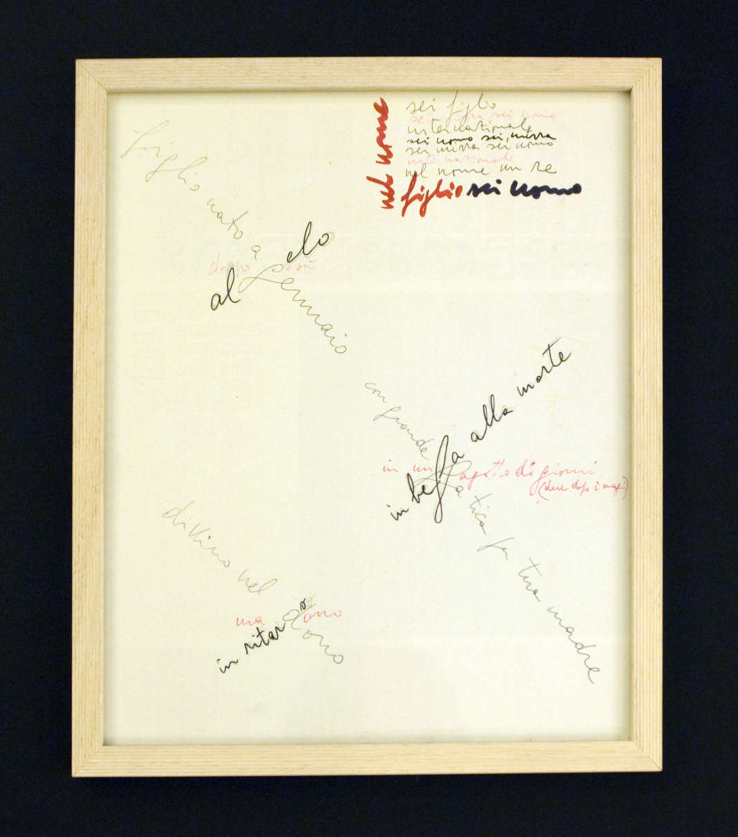
Continua il tema del Natale il quadro“Figlio nato a gennaio” (vedi quadro 12): |
Продовжує тему Різдва картина «Figlio nato a gennaio» (див. рис. 12): figlio nato a gennaio al gelo dopo gesù con grande fatica per tua madre in beffa alla morte in un fagotto di giorni (due dopo i magi) divino nel dono, in ritardo, ma dono sei figlio sei mirra, sei uomo internazionale sei uomo, sei mirra sei mirra, sei uomo internazionale nel nome un re figlio sei uomo У цьому творі мова йде про сина Давида, народженого у січні (8 січня), через 2 тиждни («декилька днив» - “un fagotto di giorni”) після Ісуса: «figlio nato a gennaio al gelo dopo gesù», «in un fagotto di giorni (due dopo i magi)». Автор проводить чітку паралель (як і в попередньому творі) між своїм сином Давидом, царем Ізраїлю Давидом («nel nome un re») – прообразом і прямим предком Христа та самим Ісусом. Він називає свого сина божественним подарунком («divino nel dono, in ritardo, ma dono») та помазаним, обраним («sei mirra»). Для кращого розуміння останньої фрази варто звернутися до епізоду із царем Давидом, коли пророк та духовний лідер ізраїльтян Самуїл обрав його своїм наступником та помазав єлеєм (аналог мірри) із рога [2, с. 176]. Крім того, усім відомо, що саме мірру як один із дарів принесли волхви у подарунок новонародженому Ісусу. Фраза «sei uomo internazionale» має подвійний підтекст: з одного боку, вона стосується біографії сина Альберто Зіґеле, який працює оглядачем Балкан, а з другого – інтернаціональності Ісуса, що є спасителем усього людства, незалежно від громадянства. Важливим у цій картині є також візуальний компонент. Якщо придивитися до розташування тексту, то неважко помітити три довгі або латинські хрести, які ще називають хрестами Розп’яття, Заходу, Життя та Страждання [4, с. 122–123]. Вертикальну перекладину хрестів творить текст сірого кольору, горизонтальну – чорного, а червоний колір нагадує нам кров розіп’ятого Христа. Підтвердженням цієї теорії може слугувати той факт, що текст, написаний червоним, дійсно стосується чи може стосуватися Ісуса: «dopo gesù», «ma dono», «in un fagotto di giorni (due dopo i magi)», «sei mirra, sei uomo... internazionale», «nel nome figlio». Цікавим є і той факт, що «тіло» найбільшого хреста містить слово «morte». |
The picture "son born in January" (see
picture 12) goes on with the theme of Christmas: figlio nato a gennaio al gelo dopo gesù con grande fatica per tua madre in beffa alla morte in un fagotto di giorni (due dopo i magi) divino nel dono, in ritardo, ma dono sei figlio sei mirra, sei uomo internazionale sei uomo, sei mirra sei mirra, sei uomo internazionale nel nome un re figlio sei uomo. In this work the subject is the author's son David, born in January (on the 8th), two weeks ("un fagotto di giorni"-a bundle of days) after Jesus: «figlio nato a gennaio al gelo dopo gesù», «in un fagotto di giorni (due dopo i magi)».The author draws a clear parallel, (as in the previous work), between his son David, Israel's king David ("nel nome un re" - a king by name), Jesus' image and ancestor, and Jesus himself. He calls his son, divine gift ("divino nel dono, in ritardo, ma dono") and anointed, chosen ("sei mirra"). To better understand this last sentence we should go back to the episode of king David: when the prophet and spiritual leader of the Hebrews, Samuel, chose him as his successor and anointed him with myrrh from a horn [2, page 176]. Everybody knows, besides, that myrrh in fact was one of the gifts the Magi brought to the newborn Jesus. The sentence “sei uomo internazionale” has a double meaning: from one point of view this sentence belongs to the biography of Alberto Sighele's son working at the Balkans' Observatory, and from another point of view alludes to the internationalism of Jesus who is mankind's saviour, regardless of the people he belongs to. The visual component is particularly relevant in this picture. If you examine the layout of the text, it isn't difficult to see three long latin crosses, that are also mentioned as Crucifixion crosses, of the West, of Life, of Passion [4, page 122-123]. The upright pole of crosses is created by the text in grey, the horizontal beam by the text in black, the red colour reminds us of the blood of crucified Jesus. To confirm this theory the fact might be pointed out that the text written in red really refers to or may refer to Jesus: "dopo Gesù", "ma dono", "in un fagotto di giorni (due dopo i Magi)", "sei mirra, sei uomo...internazionale", "nel nome figlio". Remarkable the fact that the "body" of the biggest cross contains the word "death".
|
|
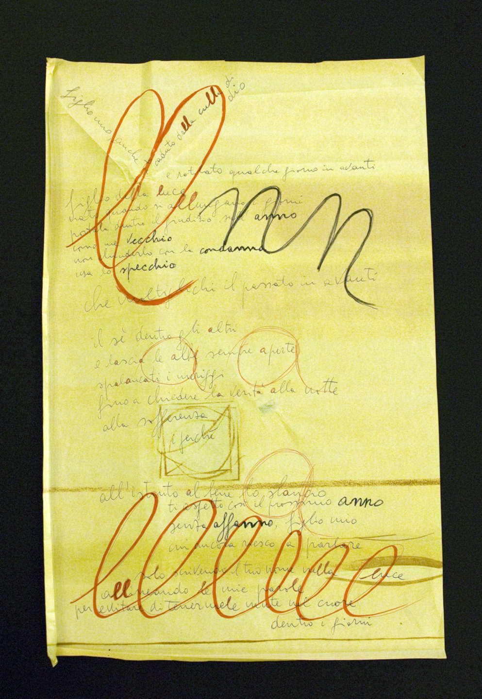
Ancora un’opera “Figlio mio” (vedi quadro13) tematicamente continua l’opera precedente: |
Ще один твір «Figlio mio» (див. рис. 13) тематично продовжує попередній: figlio mio, anche tu caduto dalla culla di dio e rotolato qualche giorno in avanti figlio della luce nato quando si allungano i giorni portala dentro il giudizio sull’anno come me vecchio non сhiuderlo con la condanna usa lo specchio che moltiplichi il passato in avanti il sé dentro gli altri e lascia le albe sempre aperte spalancati i meriggi fino a chiedere la verità alla notte alla sofferenza il perché all’istinto al bene lo slancio ti aspetto così il prossimo anno senza affanno, figlio mio cui ancora non riesco a parlare solo scrivendo il tuo nome nella luce allineando le mie parole per evitare di tenermele mute nel cuore dentro i giorni У цій картині паралель між сином Давидом та Ісусом на основі дати народження знаходить своє продовження: «figlio mio, anche tu caduto dalla culla di dio» (ці слова записані під прямим кутом у вигляді колиски), «e rotolato qualche giorno in avanti». Далі аналогія ще більше посилюється: якщо взяти до уваги те, що світло є синонімом Бога ([4, с. 320]), то словосполучення «figlio della luce» можна прирівняти до фрази «син Бога», тобто знову ж таки повертаємось до паралелі син Давид = Ісус. Візуальний компонент доповнює словесну частину, бо сам текст написаний на жовтуватому тлі, оскільки жовтий колір – найближчий до світла, перший прояв світла у речовині [3, с. 364]. Далі читаємо: «solo scrivendo il tuo nome nella luce», де слово «luce» виділене жовто-коричневим кольором. Продовжує тему фраза «nato quando si allungano i giorni», бо коли день довшає, світла стає більше. Як символ довших світлових днів автор використовує виділені червоним фломастером подовжені літери «l» у словах «dalla culla», «della luce», «allungano», «nella luce», «allineando le mie parole» тощо. Крім того, дві великі літери «ll» на початку тексту творять візуальну колиску, а вкінці повтор шести «l» створює враження безкінечності довгих днів очікування. Важливими для розуміння картини є також подвоєні «nn» у виділених чорним словах «anno», «condanna» та «affanno», що символізує вирок не бачити сина ще рік і викликає у люблячого батька страждання: «ti aspetto così il prossimo anno / senza affanno, figlio mio / cui ancora non riesco a parlare». Остання група виділених букв – «a»: відкритий звук [а] асоціюється з відкритими сходами сонця: «e lascia le albe sempre aperte / spalancati i meriggi». |
Yet another work "Figlio mio" (see picture 13)
thematically pursues the previous work: |
|
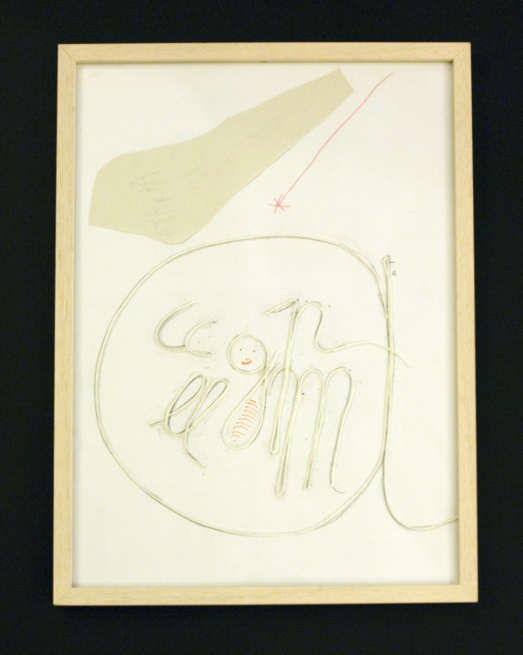
L’ opera “Agata” (vedi quadro 14) continua il tema del Natale, ma non con le parole, poiché il testo come tale qui è assente, bensì con l’aiuto di una decodificazione più complessa: lettera - parola - simbolo. Nel quadro, su uno sfondo bianco, sono collocate lettere separate di filo o spago bianco, ognuna delle quali rappresenta una certa parola e corrisponde ad un simbolo. La prima lettera “a” simboleggia Agata, così si chiama la nipotina dell’autore alla quale lui spesso si rivolge nelle sue opere. Caratteristico è che tutte le altre lettere sono contenute dalla “a”, perché il protagonista si rivolge ad Agata e proprio a lei è offerto il testo del racconto di Natale. La prossima lettera, la “p”, come se fosse estratta dalle parole “Giuseppe papà”. Agata Giuseppe papà Maria mamma Gesù asinello mucca E adesso possiamo guardare quest’opera come un quadro. In una dimensione definita, in particolare nella stalla (“a”), si trova Giuseppe (“p”), Maria (“m”), la mucca (“cc”), l’asinello (“ll”) e in mezzo il neonato Gesù (“g” disegnata con occhi, boccuccia e avvolta nelle fasce). Dall’alto cade la stella di Betlemme, disegnata da Agata. Secondo la mia opinione quest’opera può essere un esempio evidente della teoria dell’autore di come ogni lettera originariamente contiene dentro di sé l’informazione codificata di quello che noi comunque quotidianamente ci mettiamo. Come vediamo l’opera “Agata” è quel ponticello tematico che unisce il tema del Natale con le opere rivolte alla nipotina Agata. |
Твір «Agata» (див. рис. 14)
продовжує
тему Різдва,
але вже не
словами,
оскільки
текст як
такий тут
відсутній, а
за
допомогою
складнішого
шифрування:
літера –
слово –
символ. На
картині на
білому тлі
викладені
білою
ниткою або
шнурком
окремі
літери,
кожна з яких
репрезентує
певне слово
і
відповідно
символ.
Перша
літера «А»
символізує
слово Агата.
Так звуть
внучку
автора, до
якої він
часто
звертається
у своїх
творах.
Прикметно
те, що всі
інші букви
розміщені
всередині
букви «А»,
оскільки
ліричний
герой
звертається
до Агати і
саме для неї
призначена
вся
подальша «оповідь»
про Різдво.
Наступна
літера «р»
наче
відірвана
від слів «Giuseppe
papà» («Йосип
батько»).
Буква «m»
символізує
маму Марію («Maria
mamma»). Із
літери «g»
починається
слово «gesù»
(«Ісус»).
Залишились
іще дві
літери «сс»,
що наче
витягнуті
зі слова «mucca» («корова») і
нагадують
роги корови,
та дві
літери «ll» зі
слова «asinello»
(«ослятко») –
вуха осляти. Як
бачимо, твір
«Агата» є тим
тематичним
містком, що
поєднує
тему Різдва
з творами,
зверненими
до внучки
Агати.
|
The work "Agata" (see picture 14)
continues the theme of Christmas, but not through words, because the text
as such is absent here, but by a more complex decodification: letter -
wprd - symbol. In the picture, on a white background, separate letters made of thread or white string are laid, each of them, to stand for a certain word and correspond to a symbol. The first letter "a" stands for Agata, the name of the author's grand daughter, whom he often addresses in his works. Noteworthy the fact that all other letters are contained by this "a", because the protagonist addresses Agata and to her special attention the narration of Christmas is offered. The next letter "p" is there as if it were extracted from the words "Giuseppe papà". The letter “m” stands for “Maria mamma”. With the letter “g” the word “Gesù” begins. The double “cc” that remain are there as if they were taken from the word “mucca” and really look like the horns of a cow and the double “ll” from the word “asinello”, are the long ears of the donkey. Agata Giuseppe papà Maria mamma gesù asinello mucca So now we may look at this work as a picture. In a definite dimension, specifically in the stable ("a") As we see the work "Agata" is the little thematical bridge uniting the theme of Christmas with the works addressed to the grand daughter Agata. |
|
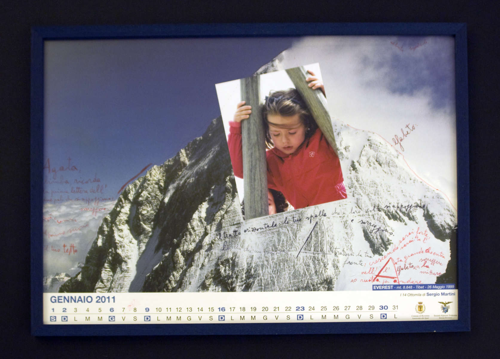
L’opera “Agata, bimba” (vedi quadro 15) ha funzione di insegnamento, perché fa conoscere alla bambina l’alfabeto, più precisamente la prima lettera, la “a”: “Agata, bimba, ricorda la prima lettera dell’alfabeto, due pali che si appoggiano e sorreggono, papà e mamma, il primo suono, il tuo tetto. Il tratto orizzontale, le tue spalle, che a loro volta si appoggiano e sorreggono. Lascia che un pensiero Attraversi la tua fronte: crescendo sarai forte, sarai tu l’Asta grande che entra nell’Alfabeto a sorreggere la scrittura o ruota per andare”. L’autore sottolinea l’importanza della lettera “A” paragonandola alla più alta montagna, l’Everest (componente visiva), al sostegno dei genitori e al primo suono, al tetto e alle spalle (componente testuale). Le due aste sulla foto e nella lettera “A” sono paragonate alla madre e al padre i quali assieme danno il tetto alla bambina. Finché Agata, è ancora bambina, il tratto nella lettera A è il sostegno dei genitori per lei, ma, diventando adulta, lei prenderà sulle sue spalle il peso di quel tratto e allora già lei si prenderà cura dei suoi genitori. Importante qui è l’immagine della montagna che impersona l’idea dell’ascensione spirituale E così qui si tratta non solo del sapere, logos (lettera “A”), ma anche dell’illuminazione interiore, perché le montagne da secoli per tutti i popoli erano il posto in cui si trovavano gli dei. |
Твір «Agata, bimba» (див. рис. 15) виконує функцію навчання, бо знайомить дитину із абеткою, точніше із першою її літерою «А»: «Agata, bimba, ricorda la prima lettera dell’Alfabeto, due pali che si appoggiano e sorreggono, papà e mamma, il primo suono, il tuo tetto. Il tratto orizzontale le tue spalle che a loro volta si appoggiano e sorreggono, lascia che un pensiero Attraversi la tua fronte: crescendo sarai forte, sarai tu l’Asta grande che entra nell’Alfabeto a sorreggere la scrittura o ruota per andare». Автор підкреслює важливість букви «А» через порівняння її з найвищою горою Еверест (візуальний компонент), підтримкою батьків, першим звуком, дахом і плечима (текстовий компонент). Два стовпи на фотографії та у літери «А» порівнюються з батьком та матір’ю, які разом забезпечують дитині дах над головою. Поки Агата ще дитина і тому для неї перекладина в літері «А» – це підтримка її батьками, але, ставши дорослою, вона сама візьме на свої плечі тягар перекладини «А» і тоді уже вона піклуватиметься про своїх батьків. Важливим тут є образ гори, що уособлює ідею духовного піднесення [1, с. 35]. Тому мова йде уже не тільки про знання, логос (літера «А»), а також про внутрішнє просвітлення, адже гори спокон віків у різних народів були місцем перебування богів. |
The work "Agata, bimba" (see
picture 15) has an educational function, for it introduces the alphabet to
the child, more exactly the first letter, the "a". “Agata, bimba, ricorda la prima lettera dell’alfabeto, due pali che si appoggiano e sorreggono, papà e mamma, il primo suono, il tuo tetto. Il tratto orizzontale, le tue spalle, che a loro volta si appoggiano e sorreggono. Lascia che un pensiero Attraversi la tua fronte: crescendo sarai forte, sarai tu l’Asta grande che entra nell’Alfabeto a sorreggere la scrittura o ruota per andare”.The author underlines the importance of the letter "a" comparing it to the highest mountain, Everest, (visual component), to the support of parents and to the first sound, to the roof and to shoulders (textual component). The two sloping poles in the picture and in the letter "A" are compared to the mother and father who together build a roof for the child. Until Agata is still a child, the horizontal line in the letter "A" is the parents's support for her, but, while growing up, she will take on her own shoulder the load of that line and at that time she will take care of her parents. Important here is the image of the mountain that personifies the idea of spiritual ascension [1, page 35]. Thus here not only knowledge is dealt with (letter "A"), but also inner enlightment, in fact down the centuries for many people mountains were the place where gods lived. |
|
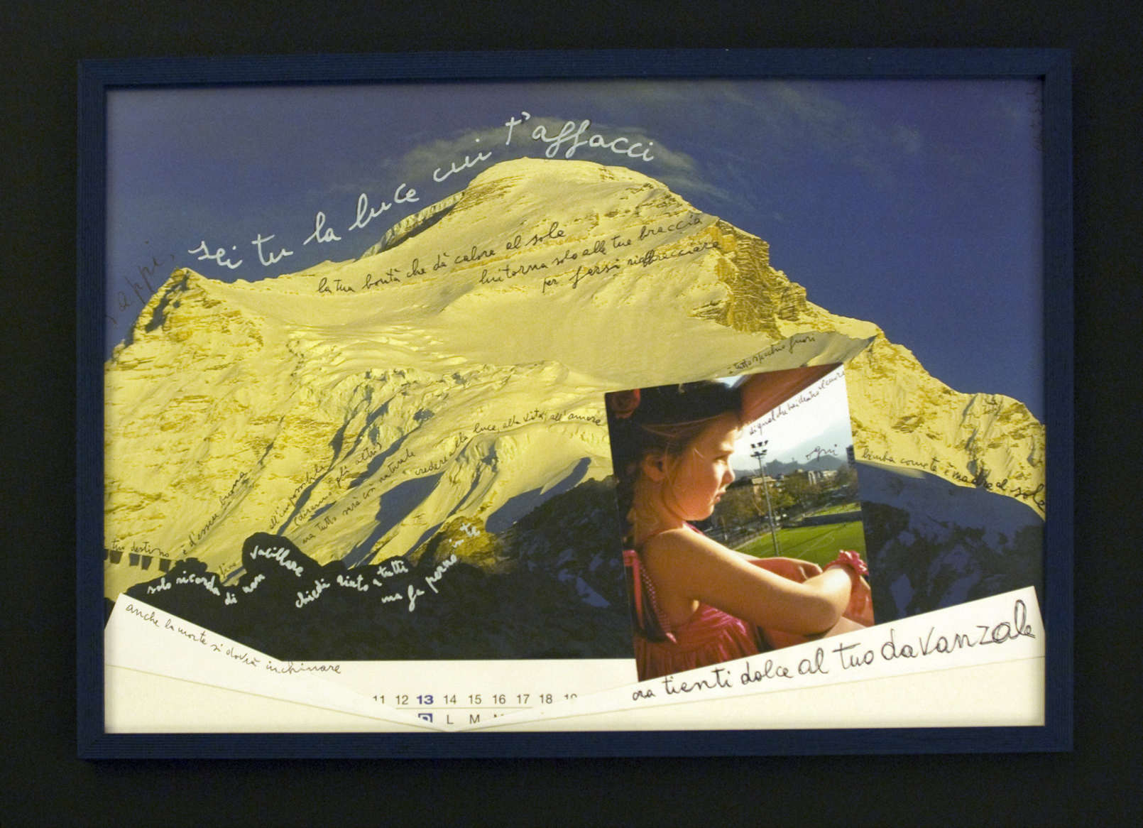
L’immagine della montagna e il simbolismo dell’illuminazione interiore sono presenti anche nei prossimi due quadri. Primo tra loro “Sappi, sei tu la luce” (vedi quadro 16) è un rivolgersi alla nipotina Agata, che viene paragonata alla luce: |
Образ гори та символіка внутрішнього просвітлення характерні і для двох наступних картин. Перша з них «Sappi, sei tu la luce» (див. рис. 16) є зверненням до внучки Агати, яка порівнюється зі світлом: Sappi, sei tu la luce cui t’affacci la tua bontà che dà calore al sole lui torna solo alle tue braccia per farsi riabbracciare tuo destino è d’essere buona fino all’impossibile (diranno gli altri) ma tutto sarà così naturale credere alla luce alla vita all’amore solo ricorda di non vacillare chiedi aiuto a tutti ma fai perno in te anche la morte si dovrà inchinare è tutto specchio fuori di quel che hai dentro al cuore ogni bimba come te è madre al sole ora tienti dolce al tuo davanzale Візуально картина являє собою колаж зі сторінки календаря та фотографії Агати біля вікна. Оскільки фотографія розташована на тлі яскраво освітленої гори, складається враження, що саме на цю освітлену гору дівчинка і дивиться: «sappi, sei tu la luce cui t’affacci». Образ світла проходить через увесь твір, тому важливо з’ясувати його символіку: «Світло традиційно уподібнюється духу і божеству, є символом святості, благородства, краси, вважається проявом мудрості та благодійництва. Світло – насамперед атрибут сонця...» [1, с. 176]. В іншому словнику символів читаємо: «Світло – перше творіння.., синонім добра і Бога... Світло Сонця уособлює духовні знання... Світло також символ безсмертя, вічності, раю, чистоти, одкровення, мудрості, величі, радості та самого життя» [4, с. 320–321]. Як бачимо, усе це знаходить своє втілення у тексті твору: «la tua bontà che dà calore al sole», «credere alla luce alla vita all’amore», «anche la morte si dovrà inchinare». Отже, для автора світло є синонімом слів «доброта», «життя», «любов», перед якими навіть смерть повинна відступити, адже світло – це символ безсмертя, світло – це Бог. Далі, як і в картині «Mi guardo allo specchio e ti vedo», з’являється образ дзеркала як символу душі: «è tutto specchio fuori / di quel che hai dentro al cuore». Оскільки все навколо, як дзеркало, відображає внутрішній світ людини, то світло, на яке дивиться Агата і яке повертається в її обійми, свідчить про духовну красу, чистоту та святість маленької дівчинки, відкритої світлу, життю та любові. |
The image of the mountain and the symbolism
of inner enlightment are present also in the next two pictures. The first
"Sappi, sei tu la luce" (see picture 16) is an address to his
grand daughter Agata, who is associated to light. Sappi, sei tu la luce cui t’affacci la tua bontà che dà calore al sole lui torna solo alle tue braccia per farsi riabbracciare tuo destino è d’essere buona fino all’impossibile (diranno gli altri) ma tutto sarà così naturale credere alla luce alla vita all’amore solo ricorda di non vacillare chiedi aiuto a tutti ma fai perno in te anche la morte si dovrà inchinare è tutto specchio fuori di quel che hai dentro al cuore ogni bimba come te è madre al sole ora tienti dolce al tuo davanzale Visually the picture is a collage of a calendar page and a photo of Agata at a window sill. As the photo is on the powerfully lit background of the mountain, the perception gets conveyed that it really is at the luminous mountain the little girl is looking: “Sappi, sei tu la luce cui ti affacci”. The image of light gets hold of the entire picture and it is therefore very important to grasp its symbolism. "Light is traditionally the image of the spirit and of divinity, is a symbol of sanctity, nobility and beauty, is considered manifestation of wisdom and goodness. Light is, first of all, an attribute of the sun..." [1, page 176]. In another vocabulary of symbols we read: "Light is the first creation, a synonym of goodness and of God...The light of the Sun personifies spiritual knowledge...light is also the symbol of immortality, eternity,paradise, purity, revelation, wisdom, majestity, joy and life itself" [4, page 320- 321]. As we can see, all this finds its realization in the text of the picture:"la tua bontà che da calore al sole”, “credere alla luce, alla vita, all’amore”,”anche la morte si dovrà inchinare”. Light is therefore a synonym for the author of the words “goodness”,”life”,”love”, before which death has to retire, because light is a symbol of immortality, light is God. Then, the same as in the picture “Mi guardo allo specchio e ti vedo”, the image of the mirror sets in as a symbol of the soul: “è tutto specchio fuori/ di quel che hai dentro al cuore”. As the inner light of a person is reflected all around as in a mirror, then the light Agata looks into, and that returns in her embrace, witnesses the inner beauty, purity and sanctity of the child, open to light, life, and love. |
|
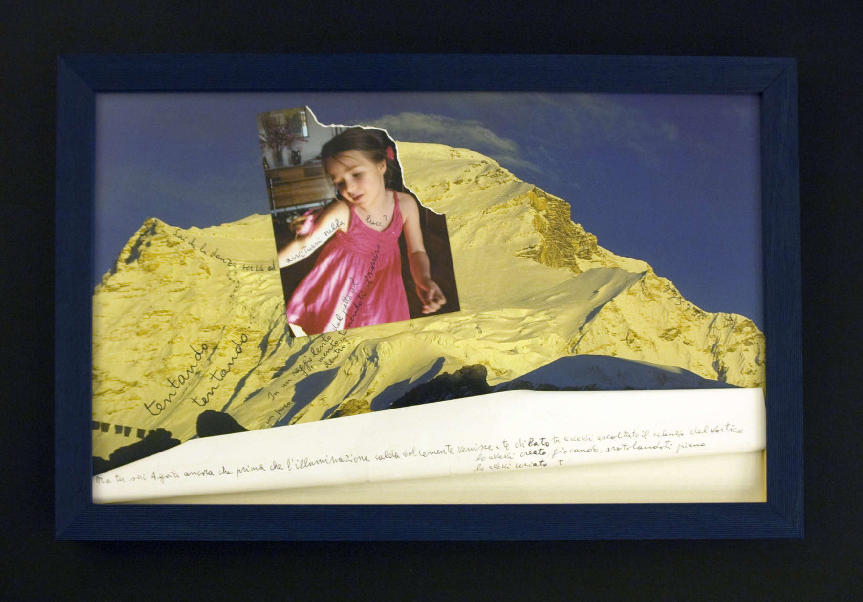
La continuazione tematica di questo “quadro fonetico” è l’opera “Sai che la danza serve ad avvitarsi nella luce?”(vedi quadro 17), che ha la stessa pagina di calendario come sfondo, ma questa volta il collage è creato con un’altra foto nella quale la bambina sta danzando: sai che la danza serve ad avvitarsi nella luce? In un raggio lento dal petto al mento tenendoti il sorriso un poco dentro? Ma tu sai, Agata, ancora che prima che l’illuminazione calda dolcemente venisse a te di lato tu avevi ascoltato il silenzio del vortice lo avevi creato giocando, srotolandoti piano, lo avevi cercato tentando tentando… Come vediamo, alla simbolica della montagna e della luce, presenti nei due precedenti quadri, si aggiunge la simbolica della danza come imitazione del “gioco” divino della creazione del mondo (“lo avevi creato giocando, srotolandoti piano”), del movimento circolare del sole nel cielo, (“la danza serve ad avvitarsi nella luce”)[4, pag 327]. Sottolineiamo il fatto che tutti i quadri riferiti ad Agata sono molto simili tra di loro: sono collages di un calendario con l’immagine di una montagna (su due quadri – montagna illuminata) e di foto della bambina. In quest’opera il simbolismo delle immagini arriva al suo culmine, perché il processo della creazione del mondo attraverso il gioco dal vortice (paragoniamo l’immagine di Shiva + il simbolismo dell’acqua come primo elemento) e i significati simbolici delle immagini della luce e della montagna, creano della bambina una piccola dea, un angelo, la cui purezza, santità, bellezza spirituale ed illuminazione non lasciano spazio ad alcun dubbio. Alla fine vale la pena osservare che la tematica dei “quadri fonetici” presenti alla mostra in “Corniceria” sono il rapporto tra uomo e donna (il sentimento dell’amore tra loro), Natale e famiglia. Però gli ultimi due temi sono molto strettamente legati tra di loro perché il figlio di Alberto, Davide, è nato poco dopo Gesù, ed è quello il motivo per cui l’autore fa continui paralleli tra suo figlio ed il figlio di Dio. Probabilmente, per il legamento tra questi eventi, per Alberto, Natale non è solo una festa, ma prima di tutto una festa familiare. Uguali, luminose associazioni sgorgano nell’autore anche ricordando la nipotina Agata, che per lui è incarnazione della purezza, santità, bellezza e di tutto quanto è buono e luminoso. |
Тематичним продовженням цієї «фонетичної картини» є твір «Sai che la danza serve ad avvitarsi nella luce?» (див. рис. 17), тлом для якого слугує та сама сторінка календаря, але цього разу колаж створено за допомогою іншої фотографії Агати, на якій дівчинка танцює: sai che la danza serve ad avvitarsi nella luce? In un raggio lento dal petto al mento tenendoti il sorriso un poco dentro? Ma tu sai, Agata, ancora che prima che l’illuminazione calda dolcemente venisse a te di lato tu avevi ascoltato il silenzio del vortice lo avevi creato giocando, srotolandoti piano, lo avevi cercato tentando tentando… Як бачимо, до символіки гори та світла, що представлені в двох попередніх картинах, додано символіку танцю як імітації божественної «гри» творення світу («lo avevi creato giocando, srotolandoti piano»), кругового руху сонця в небі («la danza serve ad avvitarsi nella luce») [4, с. 327]. Звернімо увагу, що всі картини-звернення до внучки Агати дуже схожі між собою: вони являють собою колажі з календаря із зображенням гори (на двох – освітленої гори) та фотографії дівчинки. У цьому творі символіка образів досягає своєї кульмінації, бо процес творення світу через гру із коловороту (порівняймо образ Шиви + символіка води як першооснови) та символічні значення образів світла і гори творять із дівчинки маленьку богиню, ангела, чиї чистота, святість, духовна краса та просвітлення не викликають жодних сумнівів. Насамкінець варто зазначити, що тематикою «фонетичних картин», представлених на виставці «Corniceria», є стосунки між чоловіком та жінкою (почуття кохання між ними), Різдво та сім’я. Проте останні дві теми дуже тісно пов’язані між собою, оскільки син Альберто Давид народився через … після Ісуса і тому автор постійно проводить паралелі між своїм сином та сином Божим. Мабуть, у зв’язку з цією подією для Альберто Різдво – це не просто свято, а насамперед родинне свято. Такі ж світлі асоціації виникають у автора і при згадці про внучку Агату, яка для нього є втіленням чистоти, святості, краси, усього доброго і світлого. |
The thematical continuation of this "phonetical
picture" is the work
“Sai che la danza serve ad avvitarsi nella luce?” (see picture 17), which
has the same calendar page as background, but this time the collage is created
with another photo where the cild is dancing: sai che la danza serve ad avvitarsi nella luce? In un raggio lento dal petto al mento tenendoti il sorriso un poco dentro? Ma tu sai, Agata, ancora che prima che l’illuminazione calda dolcemente venisse a te di lato tu avevi ascoltato il silenzio del vortice lo avevi creato giocando, srotolandoti piano, lo avevi cercato tentando tentando… As we see, to the symbolism of the mountain and of light, present in the previous two pictures, the symbolism of dance is added as imitation of the divine "play" of the world's creation (“lo avevi creato giocando, srotolandoti piano”), of the sun's circular movement in the sky, (“la danza serve ad avvitarsi nella luce”)[4, page 327]. We underline that all the pictures referred to Agata are very similar to one another: are collages of a calendar with the image of a mountain ( on two pictures - mountain in light) and of the girl's photos. In this work the symbolism of images gets to its peak, because the process of the world's creation through the whirlpool's play (compare the image of Shiva + the symbolism of water as the first element) and the symbolic meanings of the images of light and of the mountain, create a little goddess out of the little girl, an angel, whose purity, sanctity, spiritual beauty and enlightment leave no room to doubt. In conclusion it is noteworthy to point out that the theme of the "phonetic pictures" present at "Corniceria" is the relationship between man and woman (the feeling of love between them), Christmas and family. But the last two themes are very tightly bound with each other because Alberto's son, David, was born soon after Jesus, and that is the reason why the author develops so many parallels between his son and thwe son of God. Probably, owing to the tie between these events, to Alberto Christmas is not only a feast, but above all a family event. Equal, luminous associations rise in the author also at the thought of his grand daughter Agata, who is, to him, the personification of purity, sanctity, beauty and of all is good and luminous. |
| Relativamente alla forma delle opere, molte volte essa è complicata, e uno spettatore-lettore non preparato può anche non capire tutta la profondità del messaggio nascosto nella simbolica delle immagini e nella insolita struttura del testo. Le opere di Alberto Sighele richiamano allo spettatore indovinelli-rompicapo: ogni tanto si inizia dalla fine e non dall’inizio (“devo dirti che non posso”), ogni tanto per decifrare il testo bisogna risolvere il cubic Rubik linguistico, ogni tanto comporre il puzzle. Agendo in questa maniera l’autore rende le sue opere molto interessanti per lo spettatore esigente, il quale non si accontenta più dei soliti testi poetici. Ma li rende, contemporaneamente, accessibili, grazie alle immagini e associazioni, anche ad un lettore non esigente. E’ evidente che il livello di comprensione delle opere nei due casi sarà diverso; ma questo modo è l’unica possibilità di soddisfare contemporaneamente tutti gli spettatori interessati. Ritornando ancora alla forma delle opere è importante osservare che l’autore introduce nell’arte letteraria i metodi espressivi dell’arte visiva con i quali lui esperimenta molto, in particolare crea collage con cose abbastanza insolite: fili, pizzi, pagine di calendario, pezzi di foto, ritagli di disegni della nipotina Agata e perfino biscotti e suole. Per lui ogni lettera e suono ha significato. Le sue opere sono impregnate di simboli e così realizzano, tra i codici dei sistemi creativi secondari visuali, una sintetica unità. | Що ж до форми творів, то вона дуже часто є ускладненою, і непідготовлений читач-глядач може не зрозуміти всієї глибини змісту, захованої у символіці образів та незвичній структурі тексту. Твори Альберто Зіґеле нагадують реципієнтові загадки-головоломки: іноді вони починаються з кінця, а не з початку («devo dirti che non posso»); іноді, щоб дешифрувати текст, потрібно розв’язати лінгвістичний кубик Рубіка, іноді – скласти пазл. У такий спосіб автор робить свої твори цікавими для вибагливого реципієнта, який уже не хоче задовольнятися звичайними поетичними текстами. Але водночас він робить їх доступними для невибагливого читача завдяки зоровим образам та асоціаціям. Звісно, рівень сприйняття творів в обох випадках буде різним, але це унікальна можливість догодити усім зацікавленим реципієнтам водночас. Повертаючись до форми творів, варто зазначити, що у мистецтво літератури автор привносить виражальні засоби образотворчого мистецтва, з якими він багато експериментує, зокрема творить колажі з доволі незвичних речей: ниток, мережива, сторінок із календаря, частин фотографій, вирізок із малюнків внучки Агати і навіть із печива та устілок. Для нього має значення кожна буква і звук, його твори наскрізь символічні і становлять синтетичну єдність кодів зображальних вторинних моделюючих систем. |
With regard to the form of works, it is often complicated, and an unprepared spectator-reader may not be able to understand all the depth of the message hidden in the symbolism of images and the unusual structure of the text. The works of Alberto Sighele remind the spectator of riddle-rebus quizzes: sometimes you start from the bottom not the beginning ("devo dirti che non posso"), sometimes, to decodify the text, you have to solve the linguistic Rubic cubic, sometimes compose the puzzle. Operating this way the author makes his works rather interesting for a demanding spectator, who is no longer satisfied with the usual poetical texts. Yet at the same time he makes them accessible, through images and associations, also to a less demanding reader. The level of comprehension of works will be obviously different in the two cases; but this is the only way to satisfy simultaneously all the interested spectators. Getting back once again to the form of works it is noteworthy how the author introduces into the literary art the methods of espression typical of the visual art with which he is a great experimenter, specifically, he creates collages with rather unusual things: threads, laces, calendar pages, photo cuttings of his grand daughter Agata and even biscuits and shoe soles. To him every letter and sound has a meaning. His works are loaded with symbols and realize, this way, a synthetic unity from different codes of visual, secondary, creative systems. |
|
Riferimenti bibliografici 1. Zagorulko M.A. La poesia visiva attraverso il prisma del tempo: dal barocco fino al neobarocco / Maria Anatoliivna Zagorulko // Visnik Derjavnoi Akademii kerivnih kadriv culturi i misteztv. – 2010. – n°1. – pag. 39-44. 2. Mankovskaia Ya. B. Lettrism / Ya.B. Mankovskaia // Culturologhia. XX secolo: enciclopedia / gl. red., sost. i avt. proecta C. Ya. Levit. – SPb.:Univ.kn.,1998. – pag. 402. 3. Moisienko A. La poesia visiva oggi // Moisienko A. Tradizii modernu i modern tradizii / Anatolii Moisienko. – K. ; Ujgorod: Patent, 2001. – pag.19-41. 4. Nazarenko T. Le scritte calligrafiche, configurazioni testuali, poesie figurative: l’evoluzione della letteratura visiva ucraina / Tetyana Nazarenko // Poezografia: suchasna zorova poesia ucrainskoiu movoiu / [uporiad.] T. Nazareno. – K. :Rodovid, 2005.-pag.43-65. 5. Polischuk N.V. Poesia visiva della seconda metà del XX – inizio XXI secolo: “Tabella periodica delle parole” Ivana Iova / Polischuk N.V. // Actualni problemi filologhii ta perecladosznavstva: zb. Nauk. Pr. / Hmeln. Naz. Un-t; gol.red. M.E. Skiba.-Hmelnizkii, 2012.- pag. 141-149. 6. Slovar simvolov i snakov / [avt.-sost. V.V. Adamchik].-M.:AST; Minsk: Harvest, 2006.- 239 pag. 7. Soroka M. La poesia visiva nella letteratura ucraina contemporanea / Mikola Soroka // Slovo i chas.- 1994. – n°4-5.-pag.71-76. 8. Storoha B. Sulla questione delle tappe dello sviluppo della poesia concreta dall’antichità fino al XX secolo / Bogdan Storoha // Literaturoznavchi obrii: prazi molodih uchenih. – Vip.17.-K.: In-t l-ri im. T.G. Schevchennka NAN Ucraini, 2010. – pag.25-30. 9. Holl, Dj. Slovar sujetov i simvolov v iskusstve / Djeims Holl; per. c angl. i vstup. ct. A. Maikapara. – M. :KRON-PRECC, 1999- 655 pag. – (Accademia). 10. Scheinina E. Ya. Enziclopedia simvolov. – M. :AST; X. : Torsing, 2003.- 591 pag. 11. Enziclopeia simvolov / [coct. V.M. Roschal]. – M. : AST; SPb.: Sova, 2005.- 1007 pag.. Traduzione di Roza Yurchenko |
Бібліографічні
посилання 1. Словарь
символов и
знаков / [авт.-сост.
В. В. Адамчик].
– М. : АСТ ; Минск
: Харвест, 2006. – 239 с. 2. Холл Дж.
Словарь
сюжетов и
символов в
искусстве /
Джеймс Холл ;
пер. с англ. и
вступ. ст. А. Майкапара.
– М. : КРОН-ПРЕСС,
1999. – 655 с. – (Академия). 3. Шейнина Е. Я.
Энциклопедия
символов /
Шейнина Е. Я.. –
М. : АСТ ; Х. :
Торсинг, 2003. – 591 с. 4. Энциклопедия символов / [сост. В. М. Рошаль]. – М. : АСТ ; СПб. : Сова, 2005. – 1007 с.
|
Quadro 1. Io sono la porta
Quadro 2. Essere felice
Quadro 3. Іeri
Quadro 4. Sul corpo del campo
Quadro 5. Hai mai pensato…
Quadro 6. Punteggi la mia giornata
Quadro 7. Mi guardo allo specchio e ti vedo
Quadro 8. Ti tengo davanti agli occhi
Quadro 9. Il fuoco d’artificio fa di tutto
Quadro 10. Il dizionario dice
Quadro 11. Natale
Quadro 12. Figlio nato a gennaio
Quadro 13. Figlio mio
Quadro 14. Agata
Quadro 15. Agata, bimba
Quadro 16. Sappi, sei tu la luce
Quadro 17. Sai che la danza